New look, same great Trust
Trust has been around for almost exactly 15 years, and for the last 10 years we have been represented by the same logo. The simple and strong mark has been great for us. It’s been with us through thick and thin, incredible growth, and it even followed us from Mansfield to Fort Worth a few years ago. The branding and packaging design around that logo has been created as-needed by multiple people over the years. There was no central idea or plan for the branding, and it left everything feeling a little disjointed.
About a year ago we made the tough decision to rebrand the company. It’s a massive project with a lot of pressure, and on our small team with everyone already doing several jobs, it was a big commitment. We decided that it was a priority for us, we really wanted our brand to match up with all of the awesome new things we’re doing and the experienced, trustworthy company we aspire to be.

The Empty Screen
The new brand is based around this concept of the “empty screen”, a minimalist representation of the screens we use every day. The screen represents all of the possibilities of screen printing and of working with Trust. The screen’s role in the printing process mirrors Trust’s role for our customers: taking ideas, messages, and art from the digital world and transferring them into tangible, wearable garments.
The screen also represents our strong belief in the power and longevity of screen printing. We are not a digital printing company, we believe in ink buckets, squeegees, pantone books, and human printers.

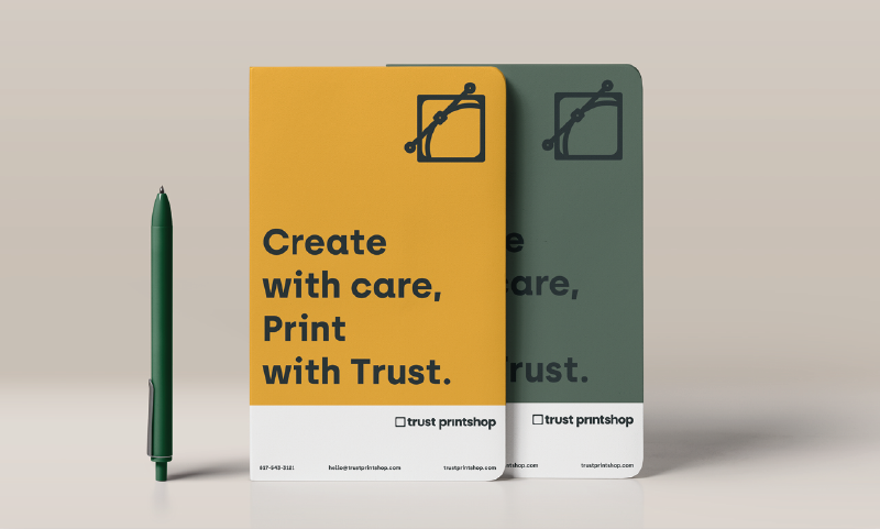
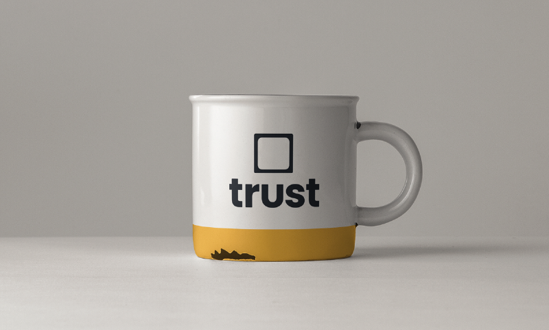
The Logo
The new logo is simple, subtle, and bold. The standard logo puts a minimal squeegee in the empty screen paired with a customised wordmark for a clean logo that looks great big or small. The squeegee helps make the screen recognizable on its own, and brings some color to the main logo. Secondary shape and layout options give us flexibility for all types of applications, and the empty screen works as a frame for all kinds of colors, illustrations, or photographs to add personality and fun to the brand.
The first thing you probably noticed if you’re familiar with our old branding is the lack of the word “printshop”. Don’t worry, we’re still a printshop (we haven’t yet transitioned into a full time dog spa) we just don’t feel the need to say it on every piece of branding we produce. Our team and people that know us well already call us by our first name, and removing such a long word from the main logo gives us so much more flexibility.